
Color goes beyond a visual component; it is an influential tool that affects feelings, perceptions and behaviors. The Color Psychology in Digital Marketing can provide a competitive edge over others in your Class when applied to the color scheme of your brand, enabling it to strike better chords with the target audience. Colors are known to influence consumer decision making. Here’s the typography behind the colors to use when it comes to breaking through that noise in your marketing strategy.
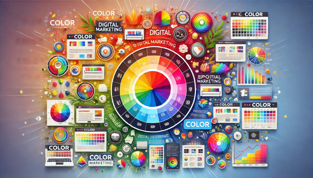
The Science behind Color Psychology
The Color Psychology — it studies how humans make decisions based on colors, and how colors affect their behavior and thinking. It’s based on the premise that different colors elicit certain emotional reactions. For example:
White: White represents harmony and serenity. Companies like Apple, Wikipedia, Cartoon Network, Honda, Puma, and others use white in their logos.
Blue: Blue is a color representing strength and trust. The following brands have blue in their logos: Twitter, Oral B, Dell, HP, and Gap. Food companies avoid using blue in their logos since it is also a color that is unattractive when it comes to food.
Red: The color red is linked to boldness, youth, and enthusiasm. Red is used in the logos of Coca-Cola, Lego, Nintendo, and Pinterest.
Green: Green is linked to health and the natural world. It even represents tranquility. Among the companies with green logos are Tropicana, Starbucks, Animal Planet, and Spotify.
Yellow: The color yellow is linked to warmth, hope, and clarity. Companies with yellow logos include DHL, Shell, McDonald’s, Nikon, Ferrari, and others.
Orange: The color orange is associated with optimism and self-assurance. Orange logos can be found on Fanta, Firefox, Harley Davidson, and Nickelodeon.
Purple: The color purple in a brand’s logo represents fantasy, inventiveness, and imagination. Among the companies with purple logos are Taco Bell, Yahoo, Milka, and Cadbury’s.
Pink: It represents serenity, feminity, and sensuality. The logos of Veet, Barbie, Victoria’s Secret, and Cosmopolitan magazine are all pink.
The Importance of Color in Digital Marketing
In the digital space where attention spans are short color acts as a defining factor in:
Brand Identity: The colors you select are branding elements that help define your logo, website and marketing materials. For example, Coca-Cola’s red communicates excitement, whereas Facebook’s blue inspires trust.
Conversions and Call-to-Action Buttons: Research states that the color of a call-to-action (CTA) button can cause a substantial increase or decrease in click-through rates. CTA buttons that are red or orange typically convert better since they inspire urgency.
Color Symbolism: The meanings of colors vary across different cultures. For example, in Western cultures white signifies purity while in some Asian countries it represents mourning. Marketers need not contextualise national culture when targeting global audiences.
User experience: It helps users to get around your website or app. When used in accordance with the principles of design, a colour palette can lead users smoothly through the content; selecting a poor palette on the other hand can reduce the design, by reducing its organisation, or create confusion and frustration.

Using Color Effectively in Digital Marketing
Know Your Audience: Conduct market research to know your target audience and how to choose the color that resonates with your audience based on their preferences, demographics, and cultural background.
Create Your Brand Personality: Your color choices should match your brand’s values and messaging. For instance, a fitness brand may use energetic color combinations of red and orange, while a spa could incorporate calming colors of blue and green.
Create Contrast for Visibility: Ensure sufficient contrast between text and background colors for readability. It is precisely for this reason that it is true for mobile users.
Test and Optimize: Use A/B testing to evaluate the effects of different color palettes on user interaction, and conversion rates.
Conclusion
Color in marketing doesn’t mean a great deal, but within digital marketing, it serves as a powerful tool to transmit a certain message or fulfil a specific aim. Once you grasp the psychology of colors and exploit them creatively, you can create campaigns that will not only attract attention but will also radiate emotion to your audience.
So, are you ready to put color principles in play to your advantage in this digital marketing world? Let’s create a powerful palette to reach out to the audience and facilitate activity.
FAQs
What are the effects of the variations of colors on the consumers? Although details vary, colors elicit different reactions, which are essentially: Green evokes ideas of growth and tranquility, blue fosters trust, yellow brings joy, and red creates a sense of urgency.
What are the tools to pick a color palette? Use tools like Adobe Color, Coolors, or Canva’s Color Palette Generator to generate cohesive and eye-catching color schemes.
What impact does color consistency have on branding? Using Colors Consistently Across All Platforms Establishes Brand Recognition and Trust It is a must to your audience for identifying your brand.
Why is background color important in website design?
Your website’s background color creates the mood. While a vibrant background could give off an air of energy, a clean, neutral background usually makes reading easier.
Any common mistakes when using color in marketing? Well, generally, its overdoing colours, ignoring cultural differences, and disregarding accessibility through insufficient contrast.